Clarity through empathy
Redesigning a CBT App for Clinical Populations
Background
Lantern is an app-based Cognitive Behavioral Therapy (CBT) program. Lantern's CBT programs were developed and tested by researchers at Stanford University and proven to be clinically effective in the treatment of disordered eating, anxiety, and depression.
The Lantern programs all have interactive CBT tools and online coaching. With the guidance of their coach, users progress through the program at their own pace.
In 2018, Lantern contracted with a large health care provider to create a program for folks who were recently discharged from in-patient psychiatric programs. This Lantern program was meant as a supplement to existing care protocols.
Understanding the problem
The status quo
To support a new Lantern population with clinical-level comorbid mental health diagnoses, our team quickly created a new app open flow and homepage. The three main goals were to create a:
- Check-in page that funneled users into the appropriate homepage experience based on their level of distress.
- Homepage that enabled users to do content (i.e. cognitive behavioral therapy written techniques, mindfulness meditations, and educational modules) beyond the daily content given to them in their plan.
- Homepage that intelligently served up content based on the distress level reported in the check-in.
After releasing v1, we saw a major dip in engagement. I was tasked with identifying the major problems with the current designs and iterating to increase engagement.
Usability study
Initially I did usability testing of v1 on a non-clinical population. The test yielded results that showed high comprehension of the design. However, people in emotional distress react and interact with features differently than people under low or no stress. Additionally, longitudinal studies often reveal more qualitative issues that only emerge upon repeat usage.
Longitudinal user research
I designed a user research study to examine longer term use in a clinical population. I interviewed four people who were recently discharged from inpatient psychiatric care and then interviewed them again after two weeks of use.
During the first interview each interviewee came into the office, talked a bit about their background, what they were hoping to get from Lantern, and then created an account. I was careful not provide any information about Lantern's functionality a typical user (signing up on their own) would not have.
"I don't know what to choose here [on the check-in page]. I don't want to pick 'out of control' because the red feels bad…I want to just close the app and come back to it later." — test user, first round
Interviewees were instructed to use Lantern as much or as little as they wanted. After two weeks, interviewees came back to the office. This round of interviews revealed many issues with the current design that were not surfaced by the more emotionally detached usability testers.
"I'm curious about the 'suicidal' option, but am scared to click it. I'm worried that the cops will show up at my house." — test user, second round
User research analysis
After categorizing interviewee insights to find patterns, I distilled and communicated a prioritized list of the major problems.
Major problems:
- Users were frustrated by the check-in question — though selections were presented as a spectrum, users felt more than one selection could be true simultaneously and felt frustrated when asked to pick just one.
- Users knew what they wanted to do and felt disempowered by prescriptive flows that limited access to content.
- However, users were unsure what they were supposed to do once they landed on the homepage — they felt overwhelmed by options.
- Though users were given a program of content, they didn't feel like there was a plan for their recovery — they wanted to feel like they were progressing through prescribed steps.
Envisioning the solution
Identifying user scenarios
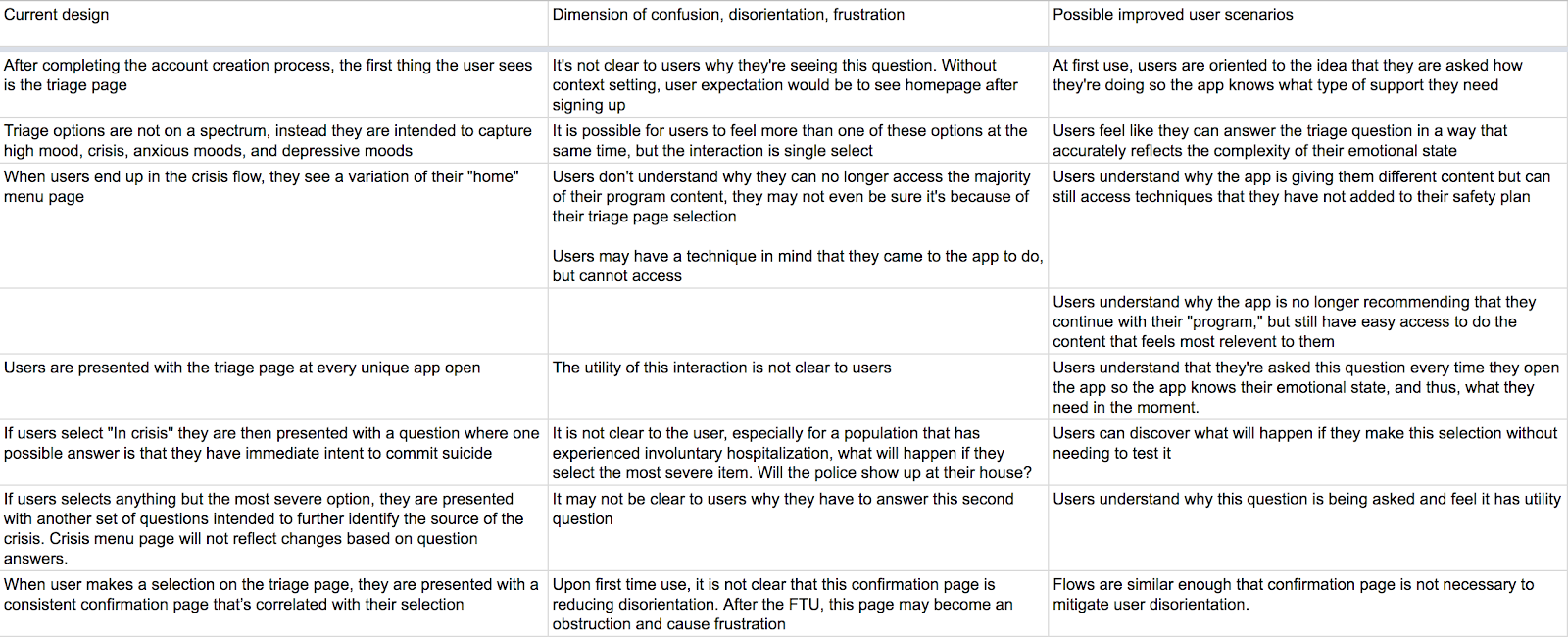
I decided to start by addressing the different problems impacting the triage page. This was the first experience users encountered when they opened Lantern, so a good place start. Using the user research, I mapped out issues with the current design and imagined improvements to the user experience.
Sketching possible solutions
Our content writer, clinical expert, visual designer, and I sketched together different ways to enact these scenarios.
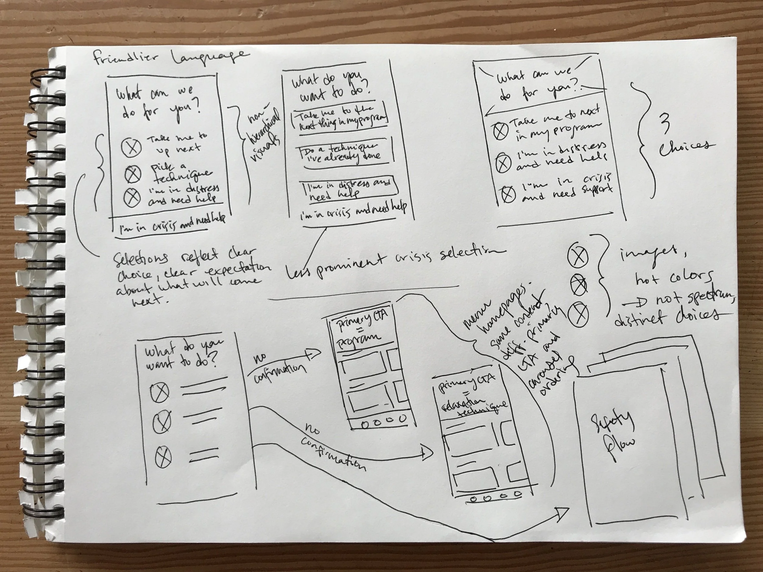
We focused on developing a more direct language, removing the sense of hierarchy, reducing redundancy in the flow, and increasing a user's sense of orientation upon selection and redirection.
We also explored ways to create more connection between the user's selection on the check-in page and the content they were presented with on the homepage.
In a series of sprints, we sketched on the other areas of the check-in and homepage touched by the problems surfaced in the user interviews.

As we sketched, we didn't go totally blue sky; our main business constraint was time and our main resource constraint was backend engineering — we thought about how to address dimensions of confusion, disorientation, and frustration altering only the design aesthetic and dynamic, but not the mechanic.
Visual design
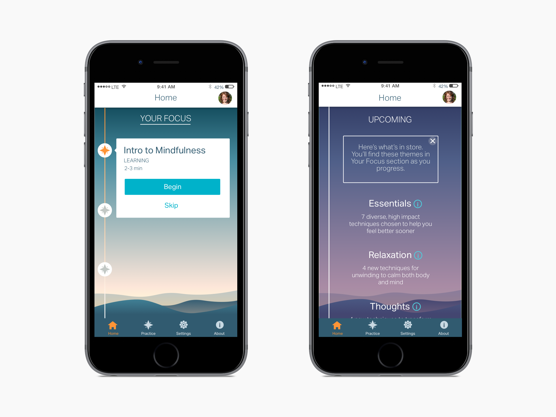
A few months earlier, in collaboration with the engineering team and our visual designer, I standardized Lantern's UI and created a design system. This change enabled us to move much faster, often skipping the wireframing stage when complicated flows were not part of the design.
After nailing down the layouts and changes in the sketching phase, we moved right into visual design. I worked with our visual designer to translate sketches into final visual designs.
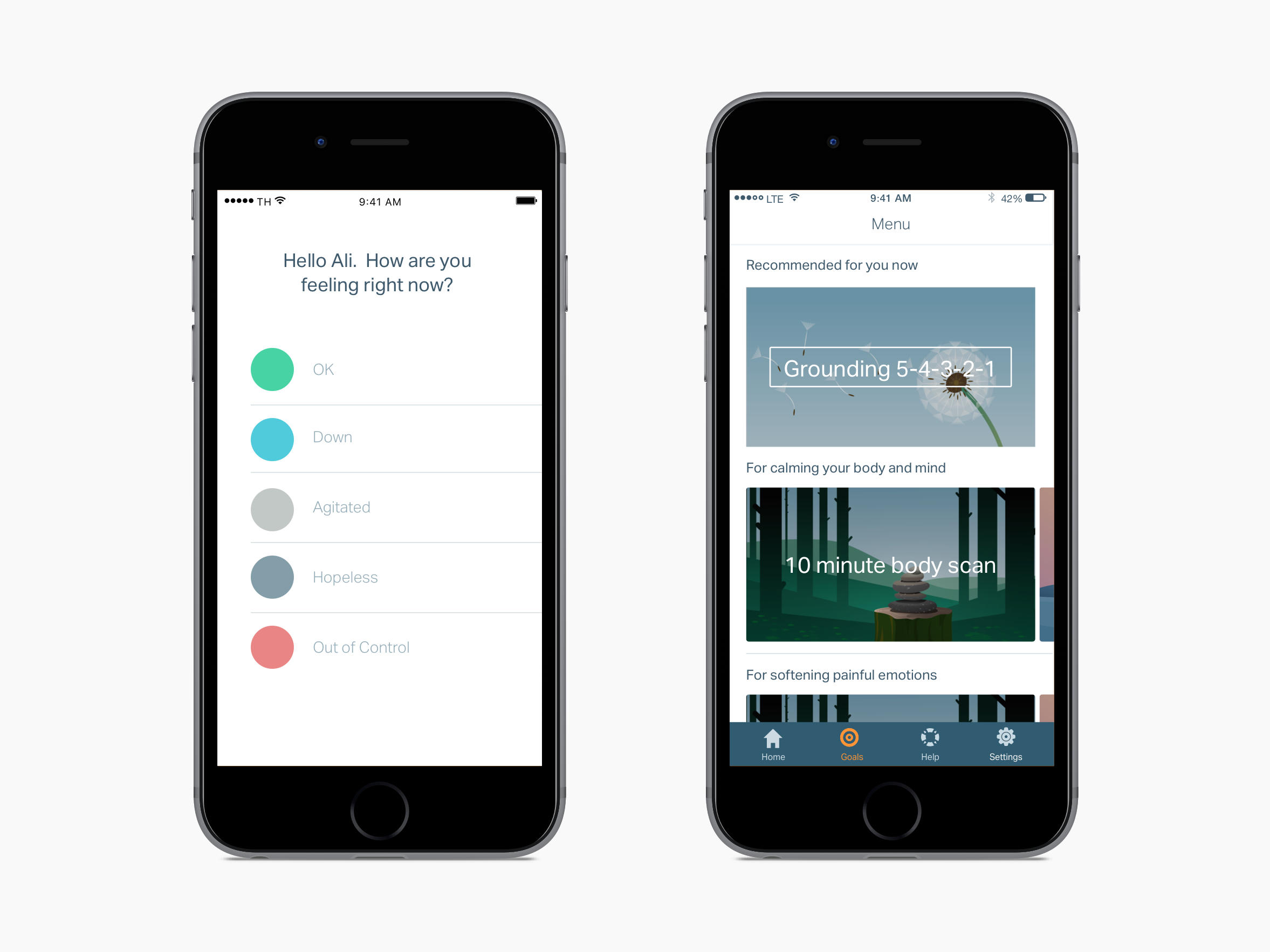
Key changes made to the check-in page:
- Users now select which flow they want to enter instead of the triage page "intelligently" routing them.
- Check-in questions are now distinct options, not on a gradient — the single select functionality is now more inline with users' expectations.
- The interstitial confirmation page was eliminated. The check-in selection and the homepage now scrolls in — making the transition more seamless and creating a more intuitive connection between the users' actions and the result of their actions.
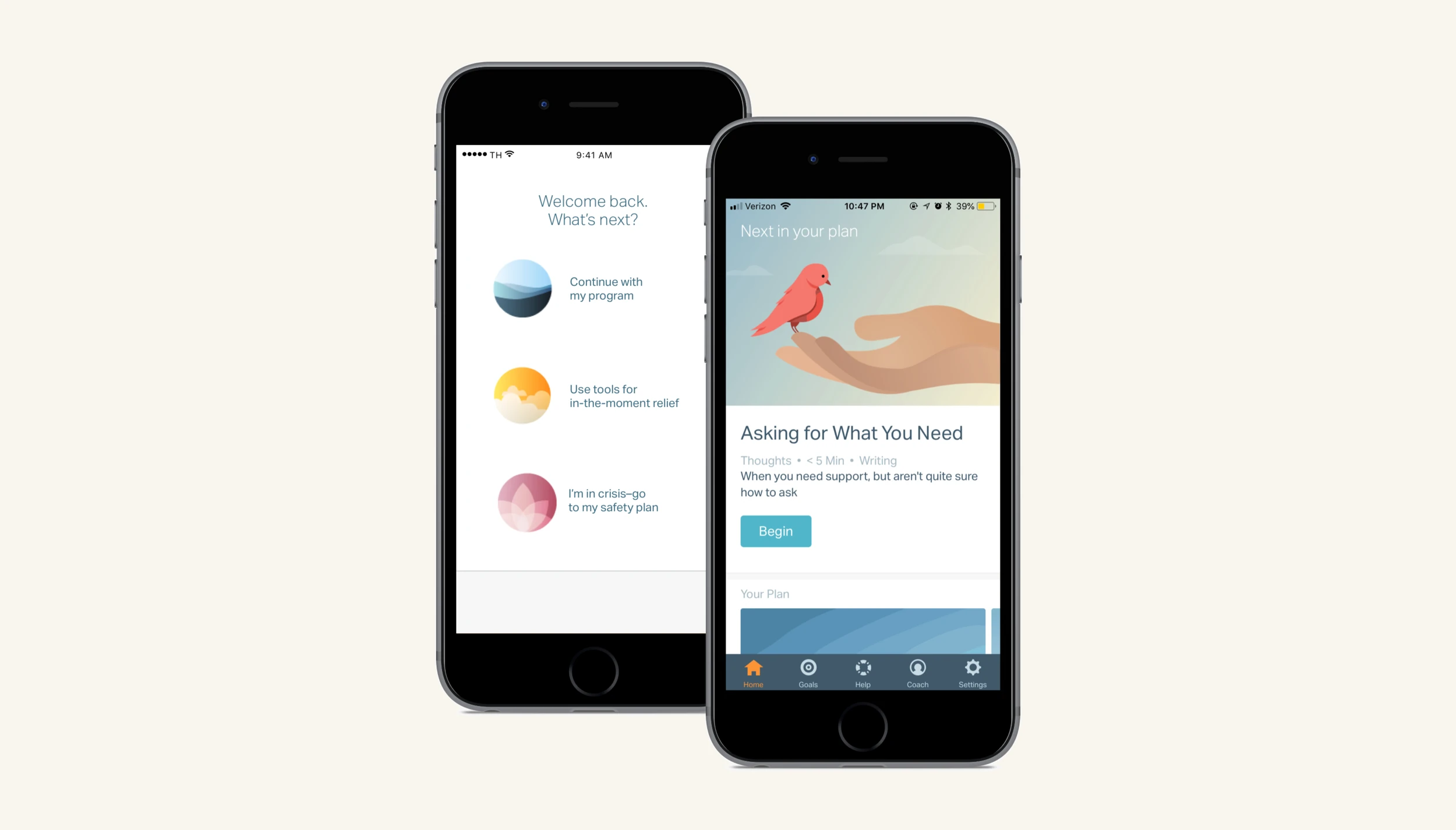
 and after (right) triage page .webp)
Over about a month, based off of the user research, we also made additional significant changes to the homepage UX while maintaining the underlying mechanic, greatly reducing the burden on backend engineering.
Key changes made to the homepage:
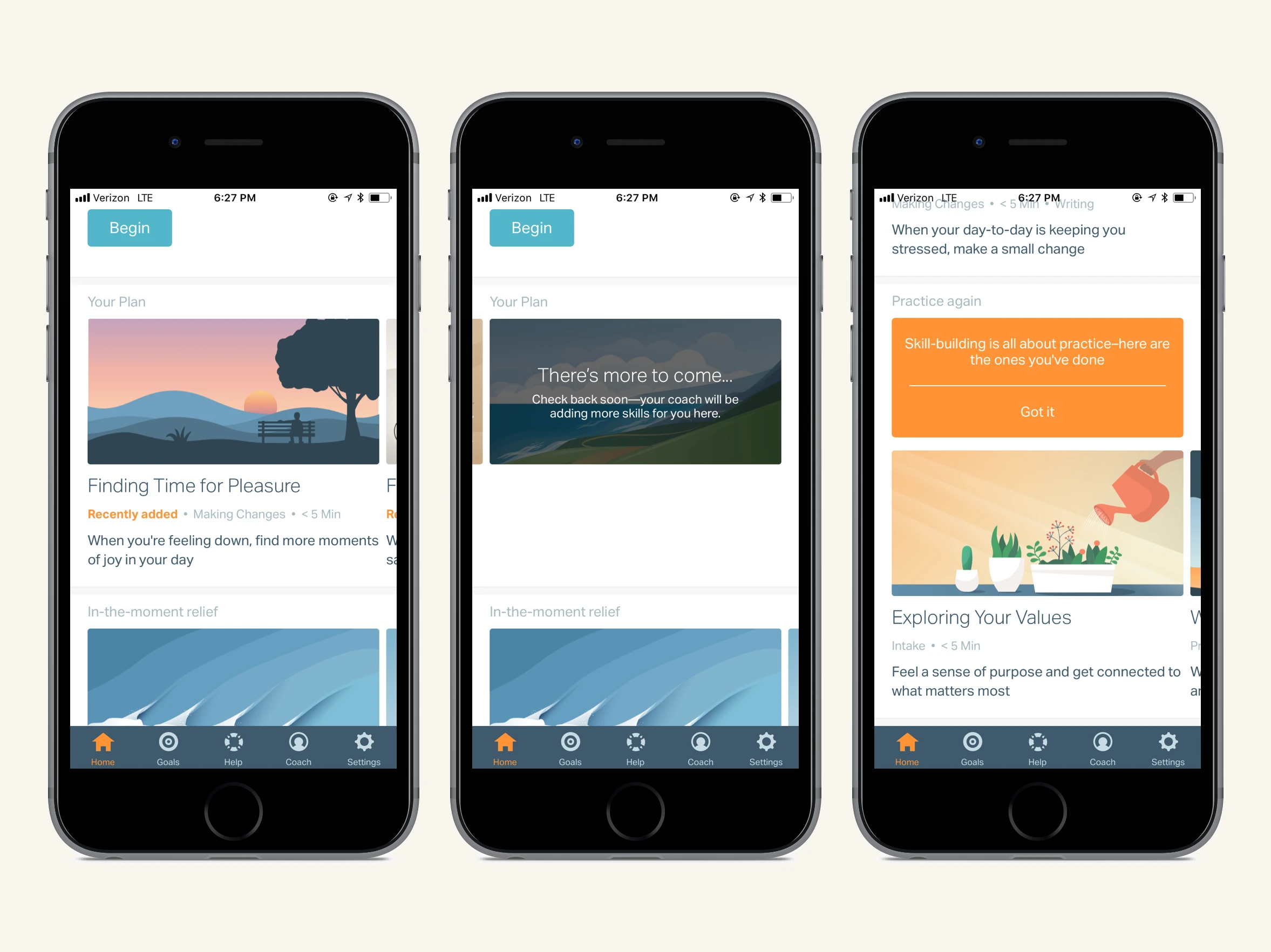
- The content hierarchy is now clear — the primary call to action is now a full bleed image accompanied by a button creating a clear sense of what a user should do next.
- Users now have more information about content before clicking into it — each piece of content is now accompanied by tags and a short descriptions to help users make more informed content selection decisions.
- Originally, each user's plan was conceptualized as a predetermined program. We re-conceptualized "Your Plan" as dynamic content controlled by each user's coach.
 and v2 (right) homepage.webp)
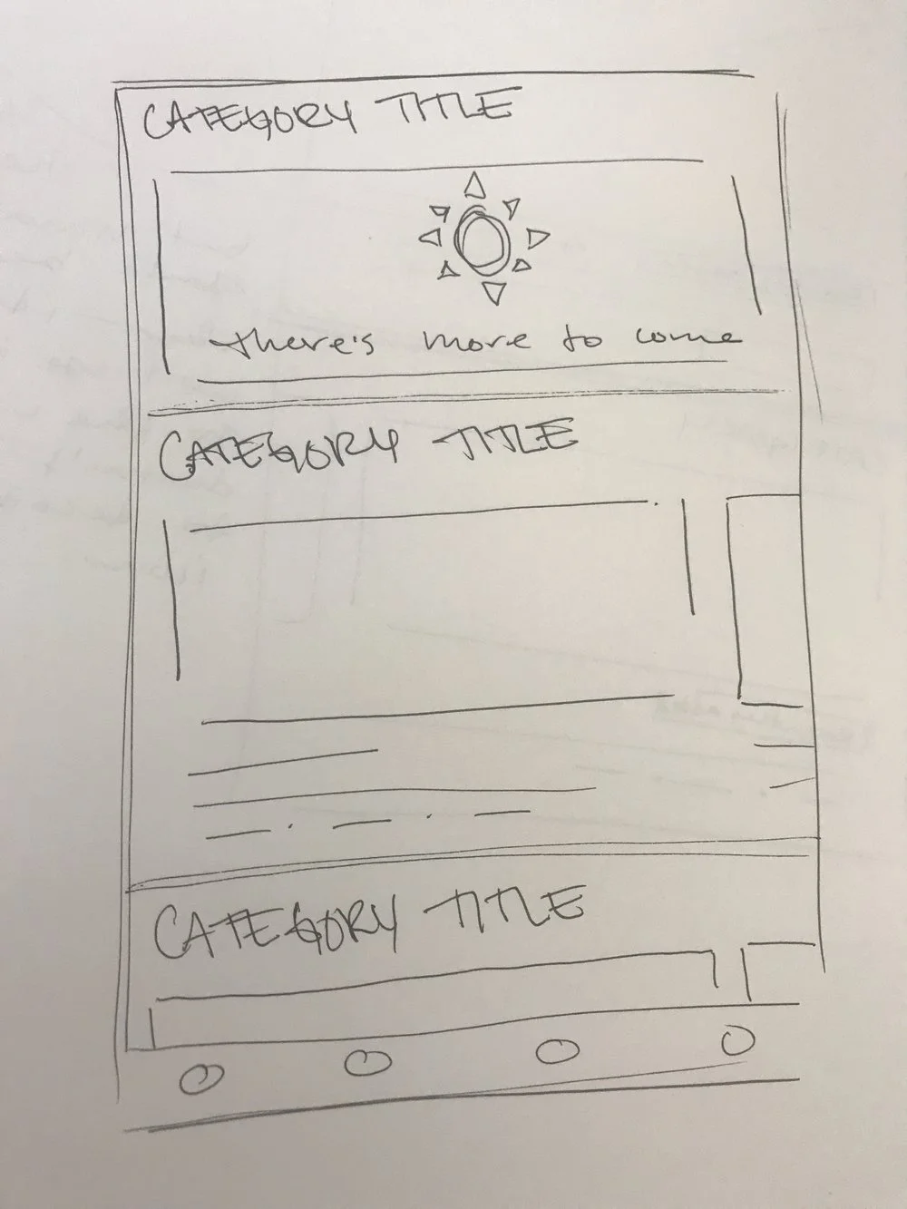
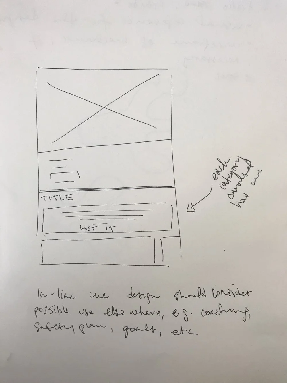
A "There's more to come…" card indicates to the user that the content in their plan is not pre-determined and will be updated by their coach.
- Users now have fewer content categories to choose between — carousels were consolidated and carousel titles were also changed to make groupings more explicit.
- Dismissible in-line cues were added to help users navigate content options.
- Our illustrations were made more prominent — overlays were removed improving the overall aesthetic.
Outcomes
Healthcare partners evaluating CBT platforms consistently cited Lantern's UX as a key differentiator in their purchasing decisions, resulting in an increase in sales.
The internal response was equally strong. By the end of the check-in and homepage iterations, the sentiment on the team was that this was the best our app had ever felt and looked. The enthusiasm carried into how we worked — the team moved faster than it ever had before.
Engagement data initially showed an uptick, though with Lantern's small user base, we primarily relied on qualitative feedback to measure success.